
Google is testing a fresh redesign for the Play Store Homepage, with the addition of a new search button to the bottom navigation bar. The Play Store Search Box at the top is now missing. The new navigation bar makes finding the Search button easier.
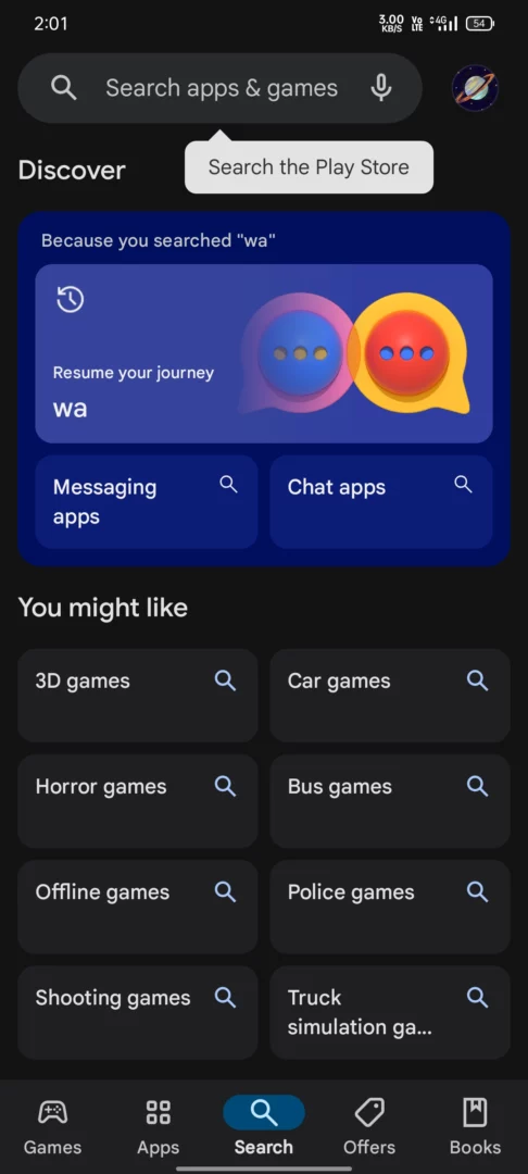
Clicking this search button opens a Discover-type feed that boasts tabs like History, Explore Apps and Games, and You might like.
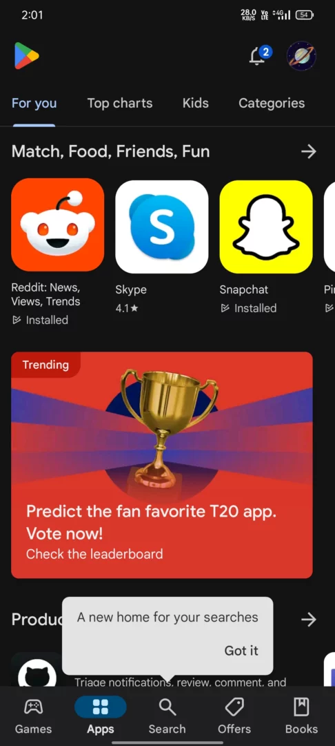
We were able to spot the user interface on Play Store version 40.6.31-29 [O] [PR] 626489609. However, given that the new layout is not widely available, the design is still under development.
As you can see above, the Search box has been removed, but the space that it occupied traditionally is still in attendance. The empty space at the top might be hinting at some unfinished work. Developers might think of filling this void.
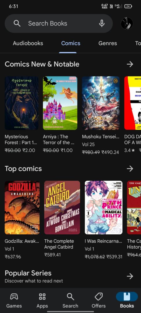
Moreover, when we click the Books section, we notice the old theme of the Play Store. Might be Google has some different plans for the section.
Google Play Store already sampled its Product Page
Same as the bottom navigation bar, the reworked Play Store Product Page is not accessible to users. We noticed this change back in early April, which shows a different layout for App Name, Publisher Name, and App Information.
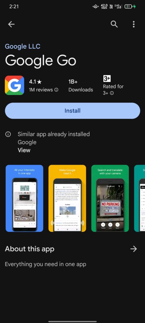
Other than the bottom navigation bar and a new Discover-type search page, all other aspects look just as now.